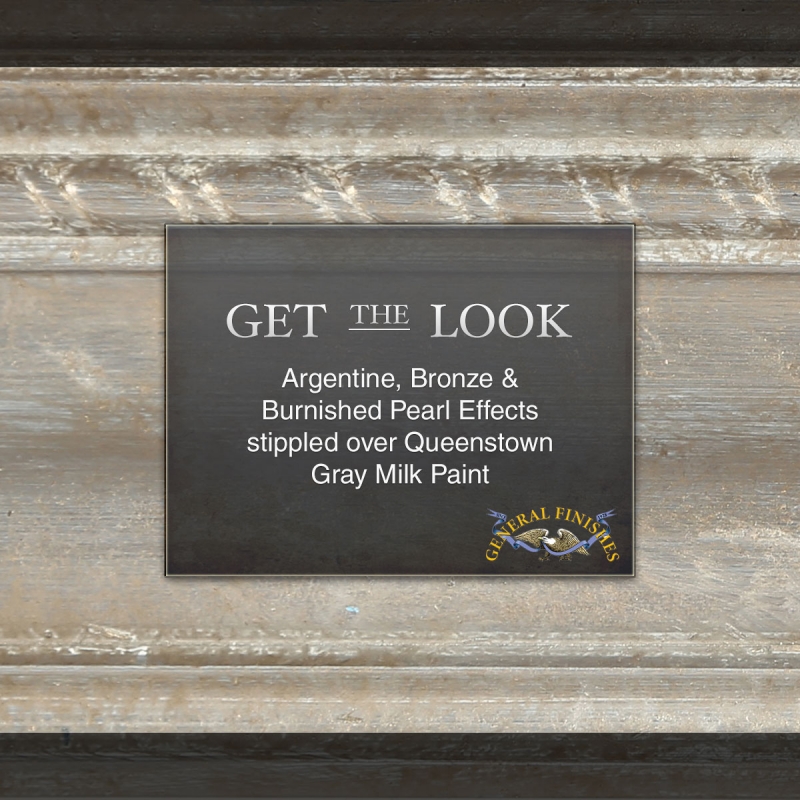
I’m working on a more modern inspired piece for a client (I shared it a few weeks ago here). We were going to go with a metallic champagne gold finish but once we saw the sample board, decided against it. I do really love the metallic look but in this case, a more subtle look was desired. Instead, we are going with General Finishes Pearl Effects over paint. It is a softer finish but can still add that pop of metallic. I’m going to use General Finishes Queenstown Gray paint with Argentine, Bronze and Burnished Pearl Effects on top.
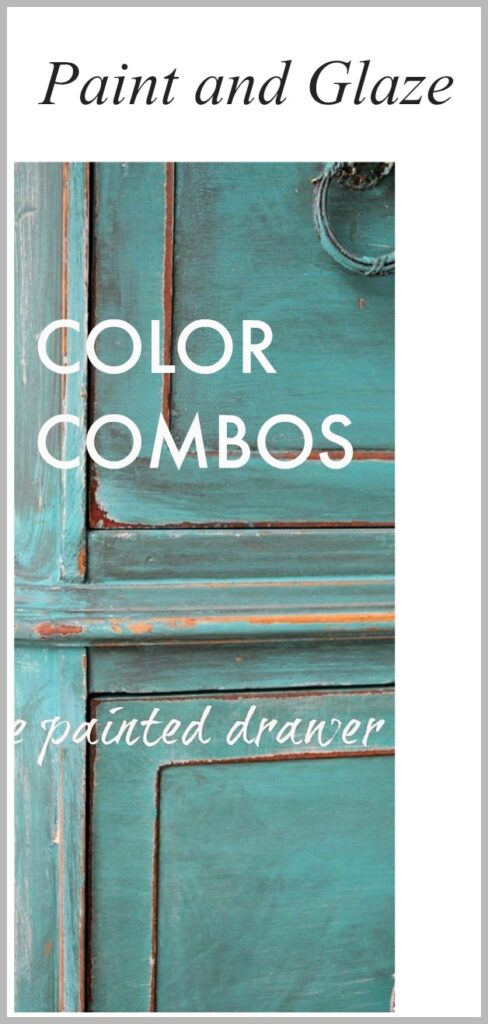
I’m really a novice with the GF Pearl Effects products. I have done quite a few different combos using General Finishes glazes over the years. Here are a few samples of great paint and glaze color combos and you can click on the picture to link to the original post.
-
- Florence/Van Dyke
-
- Basil/Winter White
-
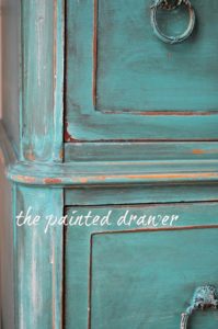
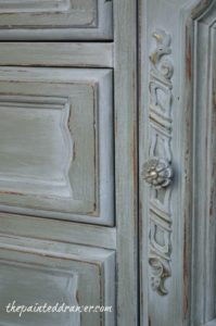
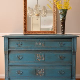
- Corinth Blue/Burnt Umber
-
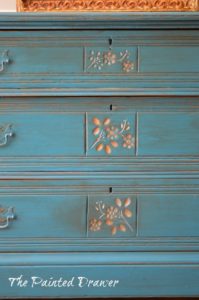
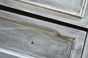
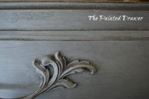
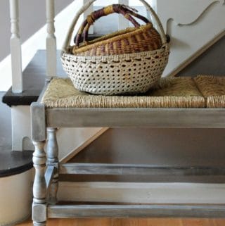
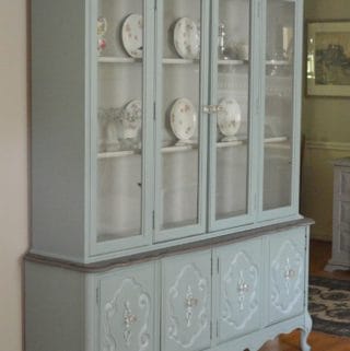
- Seagull Gray/Pitch Black
-
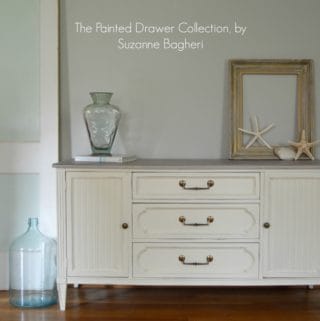
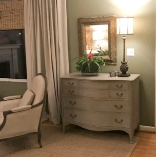
- Buttermilk/Burnt Umber
-
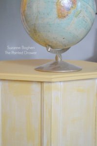
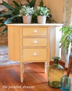
- Apricot/Winter White
-
- Lamp Black/Winter White
-
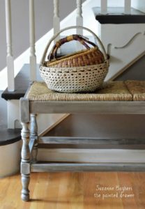
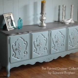
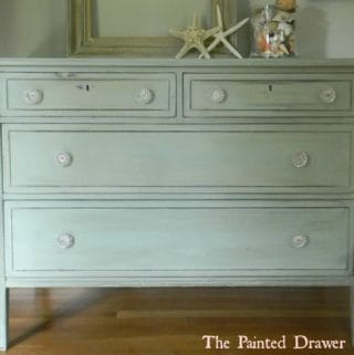
- Driftwood/Winter White
However, I’ve only used the Pearl Effects once before (Champagne over Antique White on what I believed was a vintage sewing table but is actually a vintage radio cabinet!)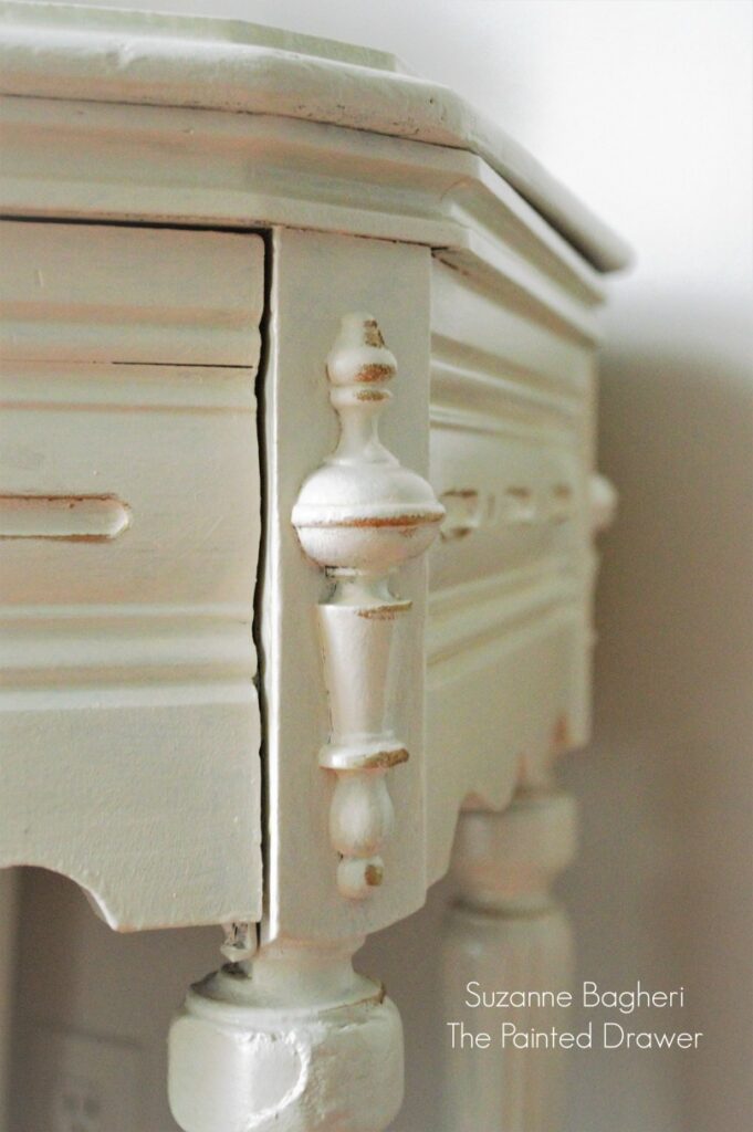
I’m looking forward to giving the Pearl Effects more of a try!
It is a very pretty effect.