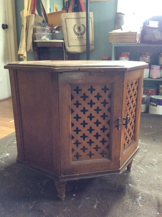
I found this great little table the other day while at the thrift store. It is very 50’s with the octagonal top. I was drawn to it because the doors are so unusual with their pretty cutout shapes. It was a whopping $15.99 so into the minivan it went!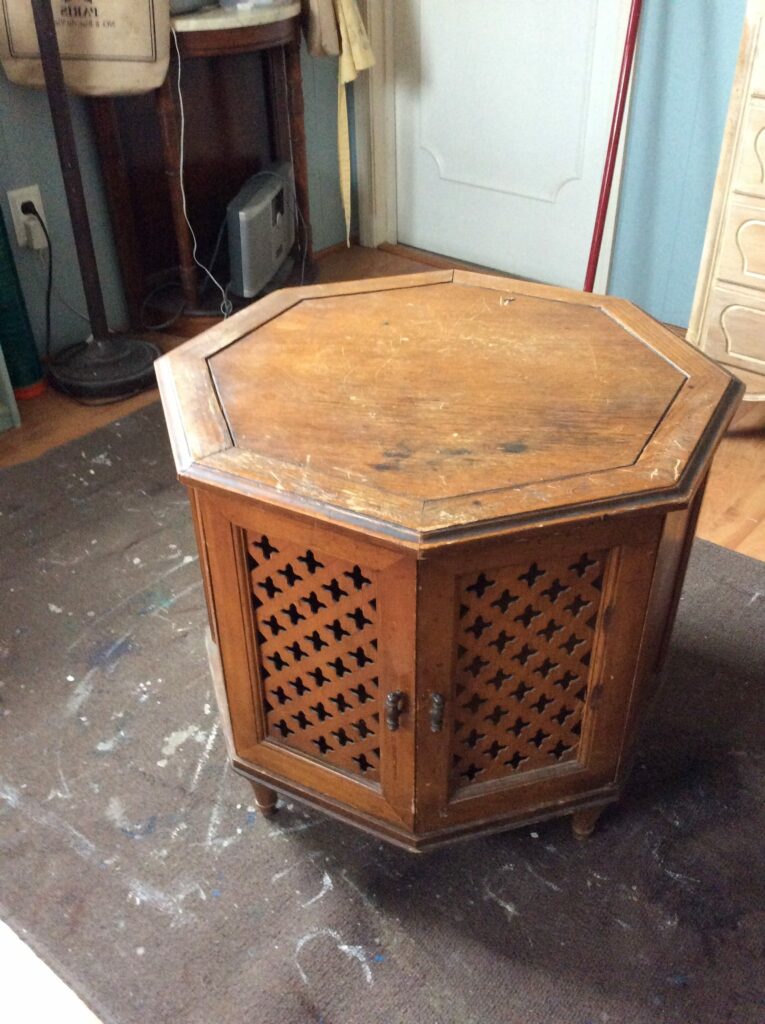

I decided to work on it today and needed to purchase the paint. I had in mind Snow White from General Finishes – a bright, modern white. My husband happened to be near the Woodworker’s Club (where I purchase my GF paints) and he volunteered to pick it up. However, he came home with a color called SunGlow – say, what? Poor guy, he tried. He thought they were all white (like Home Depot) and never even looked at the large printed SUNGLOW on the tin.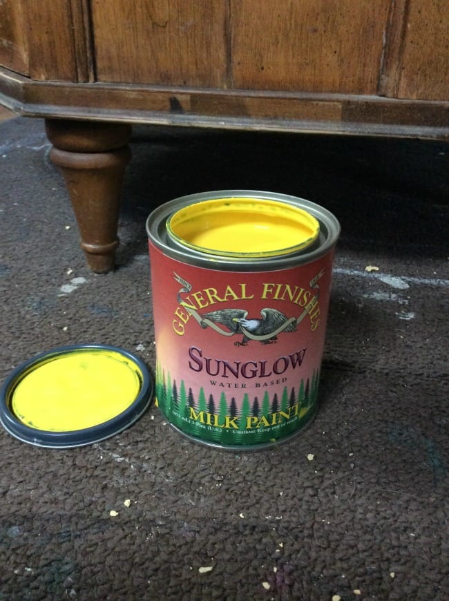
I was going to go back and exchange it but thought that, hey, maybe this was a good mistake and was kind of meant to be. Maybe it would give the table a great modern edge? I was wrong.
The color is a very bright yellow, hence the name! However, it is too hard for my taste. Sorry General Finishes, but I am not a fan. I am sure many will disagree but it isn’t my “thing”.
I only applied the first coat on the body and will change it tomorrow to a different color. At least I took a chance and maybe someday in my future I can put the SunGlow to use. Or, maybe not 😉
So, as it stands now, I have added the wood filler on the top and painted the bottom to resemble a bottle of mustard. I shall keep you updated!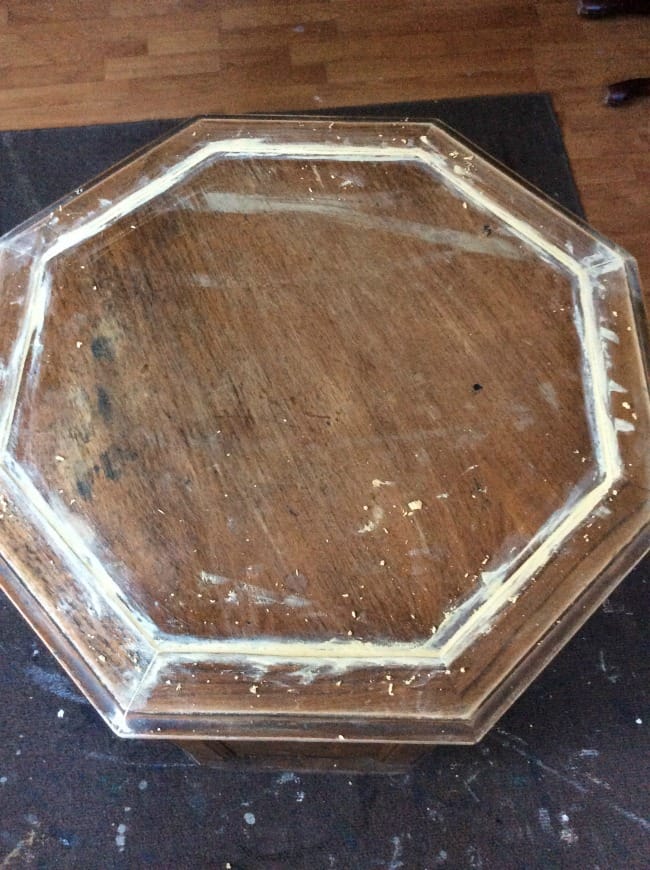

i never used sunglow- it was always way too bright for me!!!! love this little cabinet!
Hi Cassie! Yes, it is a very sweet little table. GF Apricot is doing the trick!
Good morning Suzzanne, I bet this piece will be a beauty when you are finished. I was wondering if you have a preference as to what wood filler that you use. Thanks, Linda Voudy
Hi Linda, I use Elmer’s Wood Putty. A good tip is to add plastic wrap over the top because it dries out quickly in its plastic box when opened. Cheers!
The table looks Moroccan to me. I think a bright color would be awesome! Teal? Orange? You could always mix some red with the yellow! LOL Or metallics … like punched out metal?? You’ll bring it back to life, I’m sure. Have fun! Cynthia
Cynthia that is exactly the direction that I took it! Great minds do think alike lol! I used GF Apricot and added a white glaze. I wanted to use their Pearl Effects but didn’t have any in stock but the glaze did the trick. You are so right about Moroccan – really good call!
Hi Suzanne –
This table reminds more of the 60’s when dark spanish furniture was in. I was in my 20’s then, newly married and we purchased all of that dark, heavy spanish newly married stuff! All that being said I immediately went to my current (at age 70) favorite colors.
How about painting a teal, light turquoise over the cut outs. THEN paint a white of some hue over the entire piece? What would that look like? In my mind it’s pretty great!
Wow – Linda you won’t believe it when I show the table tomorrow! You and I think alike! However, I didn’t go with a blue because I wanted to change it up and I have done so much blue lately Since the basecoat was that bright yellow, I went with Apricot to cover it. I then added a white glaze over the Apricot on the body and it looks SO good! What a great tip on the age and style. I thought it looked Spanish or Moroccan and you must be right on the age. Thanks!
You are a good wife to try making your husband’s pick work! I’m sure you’ll make it beautiful!
I agree that colour is way to bright! On the upside yellow is a great colour to have on hand if you’re mixing some custom colours 🙂 I’m looking forward to seeing the finished re-style. happy Painting1
This is true – it may be of use if I mix it with white – thanks for the tip!